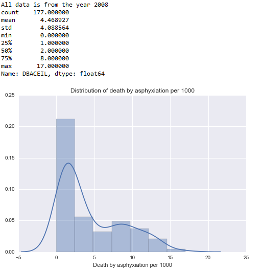
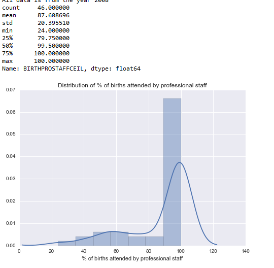
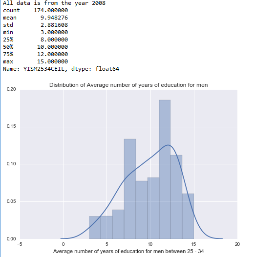
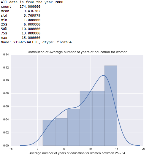
Univariate graphs for the 4 variables I have chosen:
Death by Asphyxiation:
Code:
import pandas
import numpy
import math
import matplotlib.pyplot as plt
import seaborn
data = pandas.read_csv(‘data.csv’)
data[‘YISM2534’] = pandas.to_numeric(data[‘YISM2534’])
data[‘YISW2534’] = pandas.to_numeric(data[‘YISW2534’])
data[‘DBA’] = pandas.to_numeric(data[‘DBA’])
data[‘DBACEIL’] = numpy.ceil(data[‘DBAPER1000’])
#data[‘DBACEIL’] = int(data[‘DBAPER1000’])
# Where data is not available, it is coded as 1001.
# We will change the missing data to nan.
data[‘DBACEIL’] = data[‘DBACEIL’].replace(1001,numpy.nan)
DBADescribe = data[‘DBACEIL’].describe()
print(DBADescribe)
#Univariate Graph
seaborn.distplot(data[‘DBACEIL’].dropna(), kde=”false”)
plt.xlabel(‘Death by asphyxiation per 1000’)
plt.title(‘Distribution of death by asphyxiation per 1000’)
Output:
Percentage of births attend by professional staff
Code:
import pandas
import numpy
import math
import matplotlib.pyplot as plt
import seaborn
data = pandas.read_csv(‘data.csv’)
data[‘YISM2534’] = pandas.to_numeric(data[‘YISM2534’])
data[‘YISW2534’] = pandas.to_numeric(data[‘YISW2534’])
data[‘DBA’] = pandas.to_numeric(data[‘DBA’])
print(“Number of rows in the data file” )
print(len(data))
print(“Number of variables”)
print(len(data.columns))
print(“All data is from the year 2008″)
data[‘BIRTHPROSTAFFCEIL’] = numpy.ceil(data[‘BIRTHPROSTAFF’])
# Where data is not available, it is coded as 101.
# We will change the missing data to nan.
data[‘BIRTHPROSTAFFCEIL’] = data[‘BIRTHPROSTAFFCEIL’].replace(101,numpy.nan)
BIRTHPROSTAFFDescribe = data[‘BIRTHPROSTAFFCEIL’].describe();
#print(BIRTHPROSTAFFDescribe)
#Univariate Graph
seaborn.distplot(data[‘BIRTHPROSTAFFCEIL’].dropna(), kde=”false”)
plt.xlabel(‘% of births attended by professional staff’)
plt.title(‘Distribution of % of births attended by professional staff’)
Output:
Average Education of Men:
Code:
import pandas
import numpy
import math
import matplotlib.pyplot as plt
import seaborn
data = pandas.read_csv(‘data.csv’)
data[‘YISM2534’] = pandas.to_numeric(data[‘YISM2534’])
data[‘YISW2534’] = pandas.to_numeric(data[‘YISW2534’])
data[‘DBA’] = pandas.to_numeric(data[‘DBA’])
print(“Number of rows in the data file” )
print(len(data))
print(“Number of variables”)
print(len(data.columns))
print(“All data is from the year 2008″)
data[‘YISM2534CEIL’] = numpy.ceil(data[‘YISM2534’])
# Where data is not available, it is coded as 0.
# We will change the missing data to nan.
data[‘YISM2534CEIL’] = data[‘YISM2534CEIL’].replace(0,numpy.nan)
#Univariate Graph
seaborn.distplot(data[‘YISM2534CEIL’].dropna(), kde=”false”)
plt.xlabel(‘Average number of years of education for men between 25 – 34’)
plt.title(‘Distribution of Average number of years of education for men’)
Output:
Average Education of Women:
Code:
import pandas
import numpy
import math
import matplotlib.pyplot as plt
import seaborn
data = pandas.read_csv(‘data.csv’)
data[‘YISM2534’] = pandas.to_numeric(data[‘YISM2534’])
data[‘YISW2534’] = pandas.to_numeric(data[‘YISW2534’])
data[‘DBA’] = pandas.to_numeric(data[‘DBA’])
print(“Number of rows in the data file” )
print(len(data))
print(“Number of variables”)
print(len(data.columns))
print(“All data is from the year 2008″)
data[‘YISW2534CEIL’] = numpy.ceil(data[‘YISW2534’])
#print(YISM2534FLOOR)
# Where data is not available, it is coded as 0.
# We will change the missing data to nan.
data[‘YISW2534CEIL’] = data[‘YISW2534CEIL’].replace(0,numpy.nan)
YISW2534Describe = data[‘YISW2534CEIL’].describe();
print(YISW2534Describe)
#Univariate Graph
seaborn.distplot(data[‘YISW2534CEIL’].dropna(), kde=”false”)
plt.xlabel(‘Average number of years of education for women between 25 – 34’)
plt.title(‘Distribution of Average number of years of education for women’)
Output:
Bivariate Graphs:
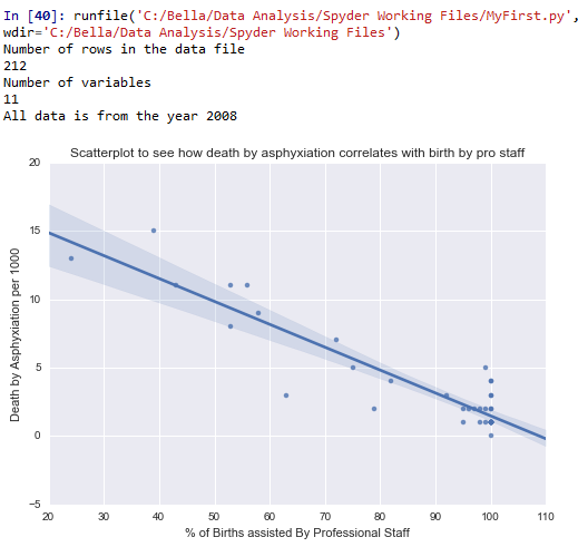
Association between death by asphyxiation and % of births attended by professional staff:
Code:
import pandas
import numpy
import math
import matplotlib.pyplot as plt
import seaborn
data = pandas.read_csv(‘data.csv’)
data[‘YISM2534’] = pandas.to_numeric(data[‘YISM2534’])
data[‘YISW2534’] = pandas.to_numeric(data[‘YISW2534’])
data[‘DBA’] = pandas.to_numeric(data[‘DBA’])
print(“Number of rows in the data file” )
print(len(data))
print(“Number of variables”)
print(len(data.columns))
print(“All data is from the year 2008″)
data[‘DBACEIL’] = numpy.ceil(data[‘DBAPER1000’])
data[‘DBACEIL’] = data[‘DBACEIL’].replace(1001,numpy.nan)
data[‘BIRTHPROSTAFFCEIL’] = numpy.ceil(data[‘BIRTHPROSTAFF’])
data[‘BIRTHPROSTAFFCEIL’] = data[‘BIRTHPROSTAFFCEIL’].replace(101,numpy.nan)
scat1 = seaborn.regplot(x=”BIRTHPROSTAFFCEIL”, y=”DBACEIL”, fit_reg=True, data=data)
plt.xlabel(‘% of Births assisted By Professional Staff’)
plt.ylabel(‘Death by Asphyxiation per 1000’)
plt.title(‘Scatterplot to see how death by asphyxiation correlates with birth by pro staff’)
Output:
Conclusion: The graph shows a negative correlation between number of deaths by asphyxiation per 1000 and % of births attended by professional staff. This means, the more the births attended by professional staff, the less the number of deaths by asphyxiation. That said, the correlation is not very tight. Part of the problem is also the lack of adequate data for % of births attended by professional staff across countries.
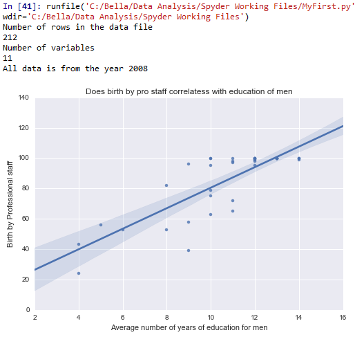
Association between % of births attended by professional staff and average education of men:
Code:
import pandas
import numpy
import math
import matplotlib.pyplot as plt
import seaborn
data = pandas.read_csv(‘data.csv’)
data[‘YISM2534’] = pandas.to_numeric(data[‘YISM2534’])
data[‘YISW2534’] = pandas.to_numeric(data[‘YISW2534’])
data[‘DBA’] = pandas.to_numeric(data[‘DBA’])
print(“Number of rows in the data file” )
print(len(data))
print(“Number of variables”)
print(len(data.columns))
print(“All data is from the year 2008″)
data[‘BIRTHPROSTAFFCEIL’] = numpy.ceil(data[‘BIRTHPROSTAFF’])
# Where data is not available, it is coded as 101.
# We will change the missing data to nan.
data[‘BIRTHPROSTAFFCEIL’] = data[‘BIRTHPROSTAFFCEIL’].replace(101,numpy.nan)
data[‘YISM2534CEIL’] = numpy.ceil(data[‘YISM2534’])
# Where data is not available, it is coded as 0.
# We will change the missing data to nan.
data[‘YISM2534CEIL’] = data[‘YISM2534CEIL’].replace(0,numpy.nan)
# A bivariate graph to check whether death by asphyxiation correlates with birth by pro staff
scat2 = seaborn.regplot(x=”YISM2534CEIL”, y=”BIRTHPROSTAFFCEIL”, fit_reg=True, data=data)
plt.xlabel(‘Average number of years of education for men’)
plt.ylabel(‘Birth by Professional staff’)
plt.title(‘Does birth by pro staff correlatess with education of men’)
Conclusion: When examining whether there is an association between the average education of men between the age group 25 – 34 and whether the women seek professional care during child birth, we see that there is a positive correlation. However, again, this correlation does not seem to be very tight. Nevertheless, the more the men are educated, the more the women in that country tend to seek professional help for child birth.
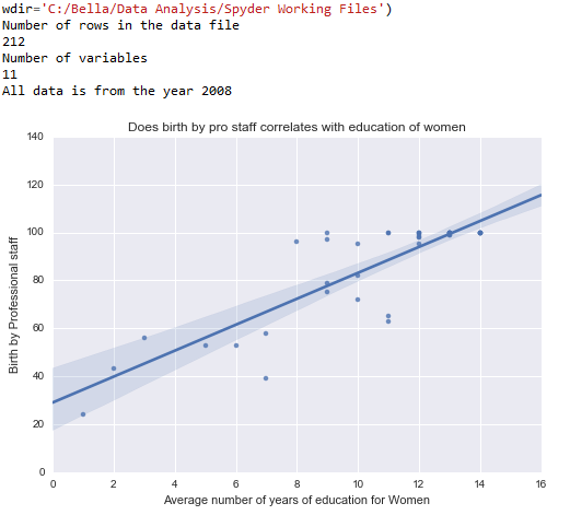
Association between % of births attended by professional staff and average age of women
Code:
import pandas
import numpy
import math
import matplotlib.pyplot as plt
import seaborn
data = pandas.read_csv(‘data.csv’)
data[‘YISM2534’] = pandas.to_numeric(data[‘YISM2534’])
data[‘YISW2534’] = pandas.to_numeric(data[‘YISW2534’])
data[‘DBA’] = pandas.to_numeric(data[‘DBA’])
print(“Number of rows in the data file” )
print(len(data))
print(“Number of variables”)
print(len(data.columns))
print(“All data is from the year 2008″)
data[‘BIRTHPROSTAFFCEIL’] = numpy.ceil(data[‘BIRTHPROSTAFF’])
# Where data is not available, it is coded as 101.
# We will change the missing data to nan.
data[‘BIRTHPROSTAFFCEIL’] = data[‘BIRTHPROSTAFFCEIL’].replace(101,numpy.nan)
data[‘YISW2534CEIL’] = numpy.ceil(data[‘YISW2534’])
#print(YISM2534FLOOR)
# Where data is not available, it is coded as 0.
# We will change the missing data to nan.
data[‘YISW2534CEIL’] = data[‘YISW2534CEIL’].replace(0,numpy.nan)
scat3 = seaborn.regplot(x=”YISW2534CEIL”, y=”BIRTHPROSTAFFCEIL”, fit_reg=True, data=data)
plt.xlabel(‘Average number of years of education for Women’)
plt.ylabel(‘Birth by Professional staff’)
plt.title(‘Does birth by pro staff correlates with education of women’)
Output:
Conclusion: When examining whether there is a relationship between the average number of years of education among women between 25 – 34 and whether they seek professional care during child birth, there seems to be a positive correlation.

